


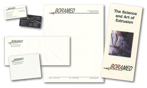
CLIENT: Boramed, Inc.
CHALLENGE:
This
company manufactures precision grade tubing used in liquid handling systems.
It was founded to complement the products manufactured by its parent company,
Diba Industries. The challenge was to create a unique look for Boramed
that would convey precision, cleanliness and have more approachable personality
than is typically found in the tube extrusion industry.
SOLUTION:
The
logo was designed to give a literal interpretation of the tubing products
manufactured by the company. The type was modified to give the impression
of tubing, and a flared tubing assembly was added to the design. The colors
brown and green were chosen to reflect the company's wooded setting and
concern for the environment.
In May, 2004 Diba Industries, including Boramed, joined the Halma Group's Fluid Technology Division.
 |
Please close this window to return to Graphic Design Porfolio